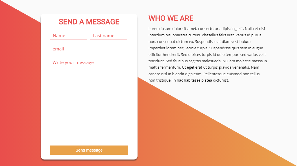
in every web site, we find a contact form that allows the users to send a message, rapport or feedback to the webmaster, and it's a way to interact with the developer, so make your contact form or your contact page look good is very important.
in this small tutorial, I will show you how to create an amazing Contact Form using only HTML5 and CSS3 so let's start.
for this tutorial, I will use Clippy to make the clip effect of the background and I will also use cssgradient.io to generate the gradient code.
the colors code that we will use are :
- 0% : #e94e4c
- 100% : #e9a24a
now let's see together the source code, of course, if you want to create it alone I invite you to watch our video tutorial and try to remake this tutorial and you can show us your work on Twitter with the hashtag #DoctorCode, we will be happy to help you and see your awesome work.
HTML CODE
<!DOCTYPE HTML>

<html>

<head>
    <link rel="stylesheet" href="main.css">

</head>


<body>
    <div class="bg">
    </div>

    <div class="container">
        <div class="contact">

            <form>
                <h1>send a message</h1>
                <input type="text" placeholder="Name">
                <input type="text" placeholder="Last name">
                <br>
                <input type="email" placeholder="email"><br>
                <textarea placeholder="Write your message"></textarea><br>
                <button>Send message</button>
            </form>
        </div>
        <div class="text">
            <h1>Who we are</h1>
            <p>Lorem ipsum dolor sit amet, consectetur adipiscing elit. Nulla et nisi interdum nisi pharetra cursus. Phasellus felis erat, varius id purus non, consequat dictum ex. Suspendisse at diam vestibulum, imperdiet lorem nec, lacinia turpis. Suspendisse quis sem in augue efficitur hendrerit. Sed ultrices turpis id odio tempor, sed varius velit tincidunt. Sed faucibus sagittis malesuada. Nullam molestie massa in mattis fermentum. Ut eget erat ut turpis gravida venenatis. Nam ornare nisl in blandit dignissim. Pellentesque euismod non tellus non tristique. In hac habitasse platea dictumst.</p>
        </div>
    </div>

</body>


</html>
CSS CODE
@import url('https://fonts.googleapis.com/css?family=Open+Sans|Roboto');
* {
    margin: 0;
    padding: 0;
    outline: 0;
}

body {
    background-color: #fafafa;
}

.bg {
    position: absolute;
    z-index: 0;
    top: 0;
    right: 0;
    bottom: 0;
    left: 0;
    background: rgb(233, 78, 76);
    background: -moz-linear-gradient(90deg, rgba(233, 78, 76, 1) 0%, rgba(233, 162, 74, 1) 100%);
    background: -webkit-linear-gradient(90deg, rgba(233, 78, 76, 1) 0%, rgba(233, 162, 74, 1) 100%);
    background: linear-gradient(90deg, rgba(233, 78, 76, 1) 0%, rgba(233, 162, 74, 1) 100%);
    filter: progid:DXImageTransform.Microsoft.gradient(startColorstr="#e94e4c", endColorstr="#e9a24a", GradientType=1);
    -webkit-clip-path: polygon(0 0, 0% 100%, 100% 100%);
    clip-path: polygon(0 0, 0% 100%, 100% 100%);
}

.container {
    position: absolute;
    z-index: 1;
    width: 80%;
    top: 50%;
    left: 50%;
    transform: translate(-50%, -50%);
    display: flex;
    height: 600px;
}

.contact {
    position: relative;
    width: 50%;
}

.contact form {
    background-color: #fff;
    border-radius: 15px;
    box-shadow: 0 5px 5px rgba(32, 32, 32, .5);
    position: absolute;
    left: 50%;
    transform: translateX(-50%);
    width: 70%;
    padding: 15px 30px;
    /*height: calc(100% - 30px);*/
    text-align: center;
}

.text {
    width: 50%;
    text-align: left;
}

h1 {
    color: rgb(233, 78, 76);
    font-family: 'Roboto', sans-serif;
    text-transform: uppercase;
    margin-bottom: 12px;
}

p {
    font-family: 'Open Sans', sans-serif;
    line-height: 1.8rem;
}

input {
    font-size: 1.2rem;
    border: none;
    border-bottom: 1px solid rgb(233, 78, 76);
    font-family: 'Open Sans', sans-serif;
}

input[type="text"] {
    padding: 5px 12px;
    margin: 10px 5px;
    width: calc(50% - 44px);
}

input[type="email"] {
    padding: 5px 12px;
    margin: 10px 5px;
    width: calc(100% - 44px);
}

input::placeholder,
textarea::placeholder {
    color: rgb(233, 78, 76);
}

textarea {
    padding: 5px 12px;
    margin: 10px 5px;
    width: calc(100% - 44px);
    height: 350px;
    resize: none;
    font-size: 1.2rem;
    border: none;
    border-bottom: 1px solid rgb(233, 78, 76);
    font-family: 'Open Sans', sans-serif;
}

button {
    background: rgba(233, 162, 74, 1);

    border: none;
    font-size: 1.1rem;
    padding: 10px 12px;
    margin: 5px 5px;
    width: calc(100% - 20px);
    transition: .4s ease-in-out;
    color: #fff;

}

button:hover {

    background: rgb(233, 78, 76);
}
and that's it now you can create your amazing contact form and impress your users, I hope you enjoyed this small tutorial if you liked it please tell us in the comment, thank you
Amazing Contact form using HTML and CSS
 Reviewed by Medics
on
March 27, 2019
Rating:
Reviewed by Medics
on
March 27, 2019
Rating:
Reviewed by Medics
on
March 27, 2019
Rating:


No comments: